X2 Options (X2 EN)
TEXTBLOCK SETTINGS
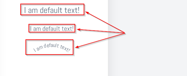
Allow default text + Default text (Designer only)
This default text will be displayed in the text field when the client creates a new text field.
Allow texts
Allow the use of predefined texts for the template
Use text set
Access a set of texts instead of selecting texts individually
Enable bold font
This allows bolding for all text fields.

Enable italics
This enables italic font for all text fields.

Enable underline
This enables underlining for all text blocks.

Enable font size
If this is enabled, the customer can change the font size on the frontend.

Allow text alignment
These options allow left-align, right-align, center, and justify alignment in the frontend when enabled.

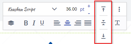
Allow vertical center alignment
These options allow top, center, and bottom alignment when enabled.

Allow letter spacing
If this option is enabled, the client gets the possibility to change the letter spacing in text fields.


Allow line height (Designer only)
This option allows the client to set the line height for multi-line text fields.
Allow font
If this option is checked, the customer can change the font, to the fonts selected in the box below. If this option is set to "No", the customer can only use the font that is present by default in the text block. The fonts can be found in the "Fonts" menu.

Use font set
Access a set of fonts directly instead of individual fonts. These sets are created in the "Fontsets" menu.
Allow fonts lazyload
This option enables the font to lazyload.
Allow default font (Designer)
This font is selected by default.
Allow background colors for fonts (Designer only)
If enabled, the client can change the background of the text block. The colors he can choose can be selected below this option. If you want to add a new color, you have to add it in the "Colors" menu.

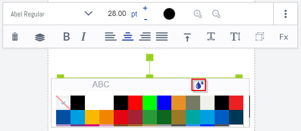
Allow font colors
This option allows the client to change the font color. The colors he can choose can be selected below this option. If you want to add a new color, you have to add it in the "Colors" menu.

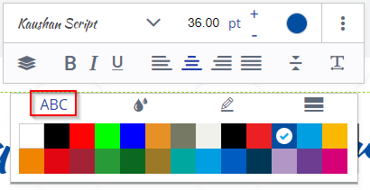
Enable background colors (OTP)
If enabled, the client can change the background of the text block. The colors he can choose can be selected below this option. If you want to add a new color, you have to add it in the "Colors" menu.

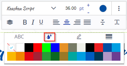
Border (OTP)
If enabled, the customer can choose a border for text blocks.
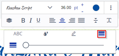
Border width (OTP)
If enabled, the customer can change the margin width.

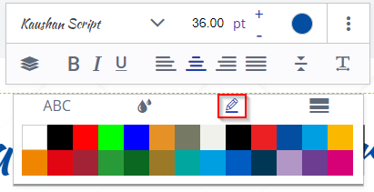
Border color (OTP)
The customer can change the border color. The selectable color can be selected below this option. If you want to add a new color, you have to add it in the "Colors" menu.

Activate zoom function (OTP)
If enabled, the active text field will be zoomed out.
Normal:
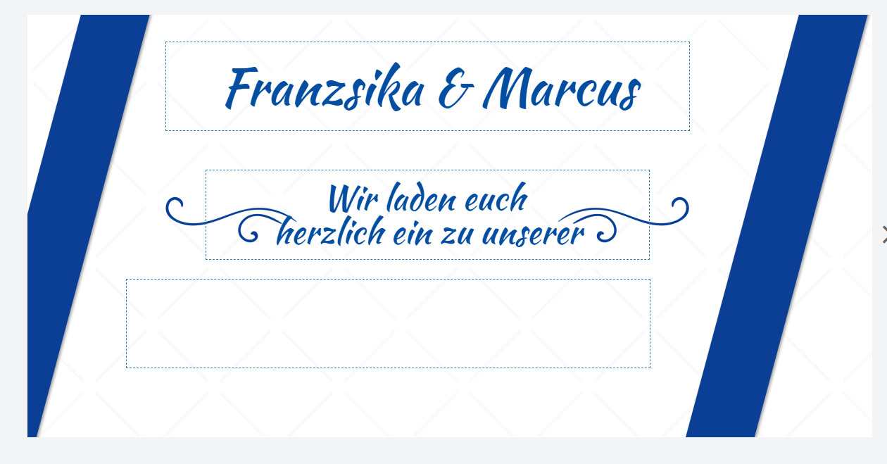
Zoomed:
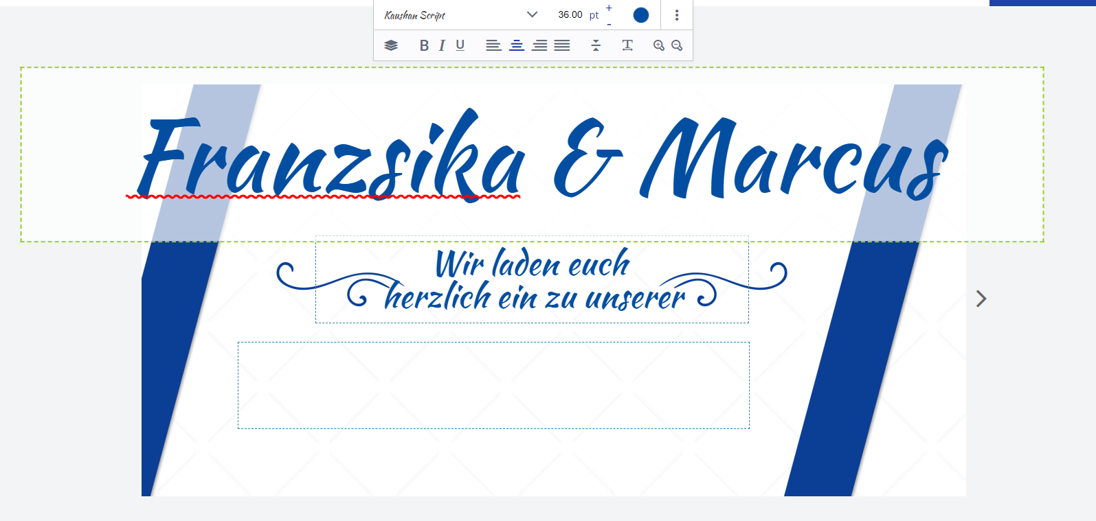
allow Zoomer TextBlocks Designer (Designer)
Allows the customer to zoom in and out of the text block, as in the OTP, but here the customer can decide how much to zoom.

IMAGE BLOCKS SETTINGS
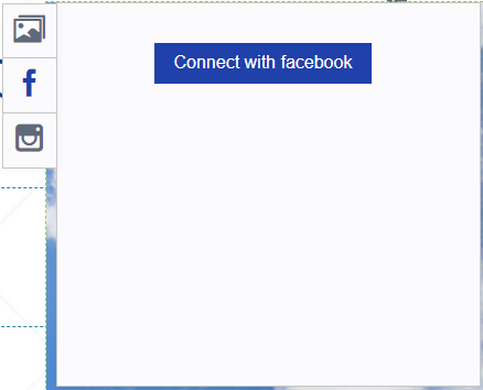
Enable Facebook Image Picker
Allows the client to connect to their Facebook account to upload their images from the account to the template. To allow the client to use this option, the Facebook App ID must be set.
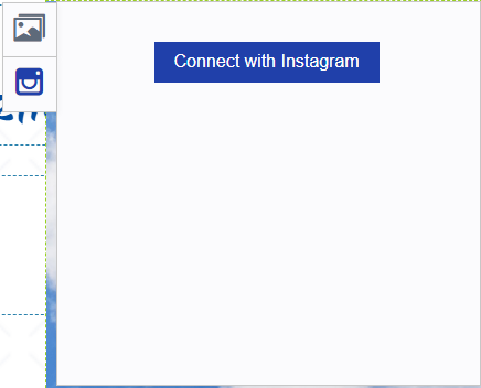
Enable Instagram Image Picker
Allows the client to connect to their Instagram account to upload their images from that account to the template. To allow the client to use this option, the Instagram client secret and Instagram redirect URL must be set.
Allow image preset
Allows the customer to use local images in his image blocks. For this, a block with the variables "SelectBox=1" and "Value=codeImage1,codeImage2,...) must be created in the template (PDF or InDesign). Within these blocks, the customer can then access the predefined images.
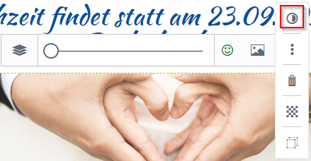
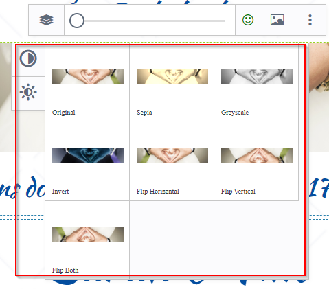
Enable effects picker
If this option is enabled, the customer can select some effects for his images.

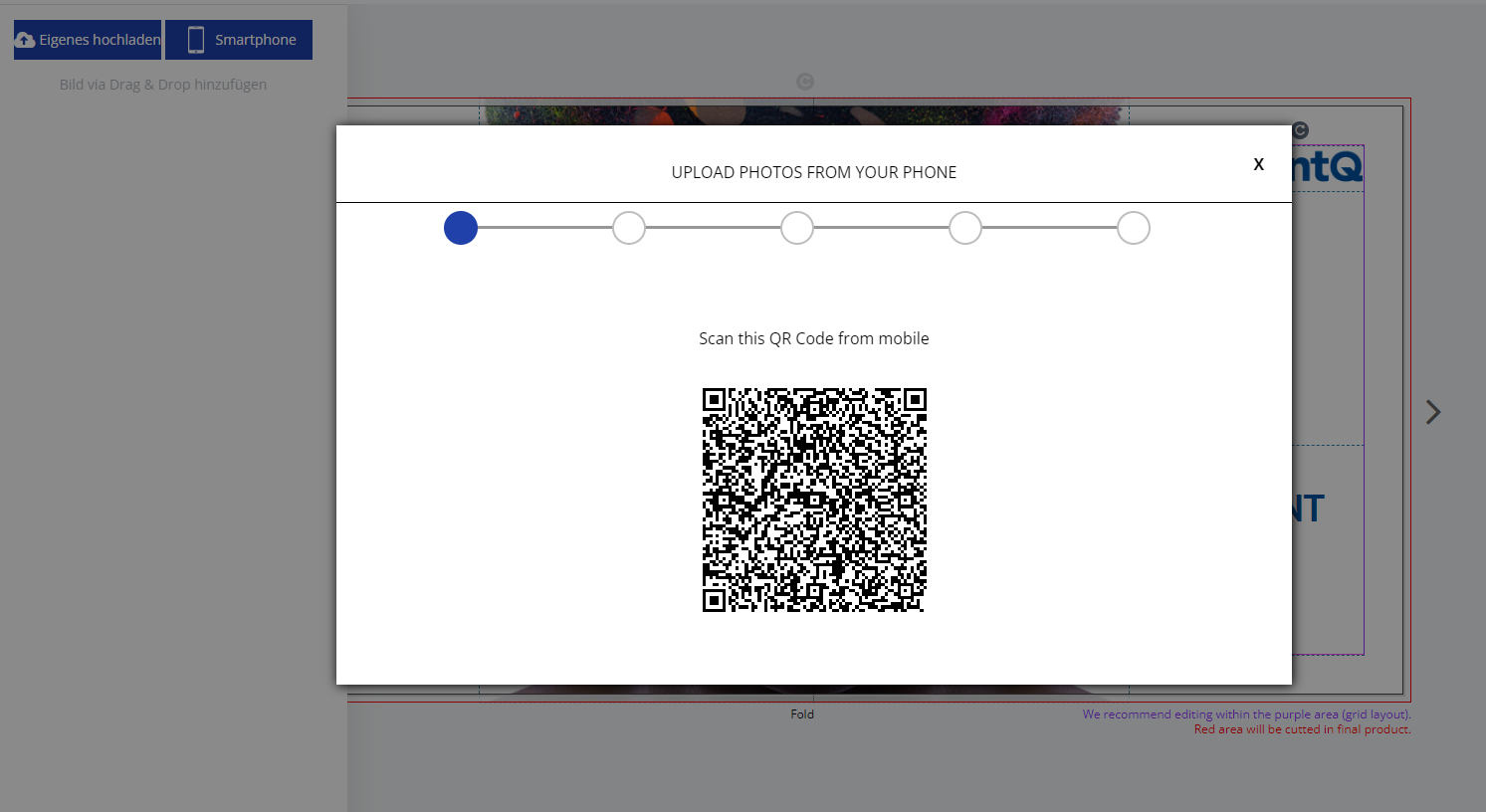
Allow direct upload from smartphone
Here you can allow customers to upload images directly from their smartphone to the editor via QR code
Allow uploaded images in blocks.
Allows the client to upload images. Allowed file types are .png, .jpg and .tiff for designer and .png or .jpg for OTP-, Form- and PDF/VT Editor.
Allow conversion to shape (OTP).
If this option is enabled, the customer can convert his image into a shape (SVG file).

PAGE SETTINGS
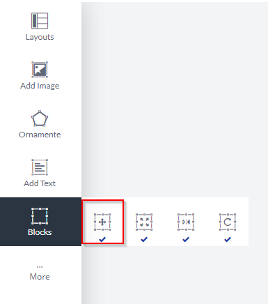
Allow moving blocks
This allows the client to move any type of block on the editor.
Allow snap block
This enables the option to allow blocks to snap together.
Allow resize block
This option allows the client to resize any block in the template.
Allow block rotation
This option allows the client to rotate any block on the template.
Enable Groupings (Designer)
This allows the client to group a number of blocks to move them around.
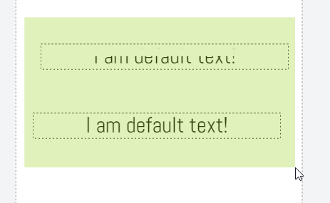
Show box size for blocks (Designer)
If this option is enabled, you will get a box (non-printing) around your blocks in the Designer editor:
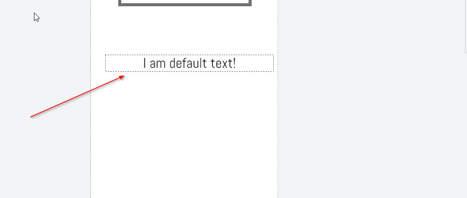
Allow QR code (OTP).
It allows the customer to add a QR code to the template.

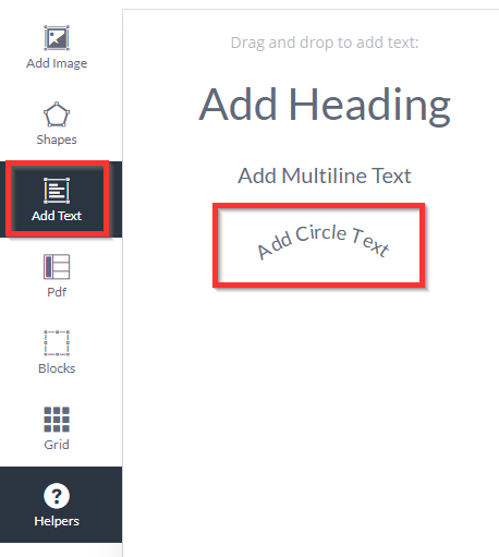
Allow adding new circular text (OTP).
It allows the client to add a circular text block to the template.
Allow deleting blocks
This allows the customer to delete blocks.

Allow block levels (OTP)
Allows changing the level of the block.

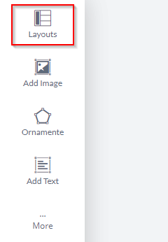
Activate layouts
This option enables layouts for the template. You can select the layouts that should be allowed for the template below. Layouts are created from the “Layouts” menu.
Allow changing background image
Allows setting a background for the template.

Allow Reset Page (OTP)
Allows the client to reset the page as if they were reopening the template.
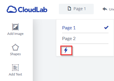
TABLE SETTINGS (OTP)
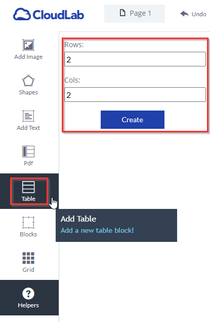
Add tables
It allows the client to add a new table to the template.
Allow fonts (table)
If enabled, the customer can change the font in the table. Below this option, you can select which fonts should be allowed for the table.

Enable font size (table)
If enabled, the customer can change the font size in the table.

Enable boldface (table)
If this is enabled, the customer can use boldface in the editor for tables.

Enable italics (table)
If this is enabled, the client can use italics in the editor for tables.

Enable underlining (table)
If this is enabled, the client can use underlining for tables in the editor.

Allow alignment (table)
These options allow left, center, and right and justify alignment in the frontend when enabled for tables.

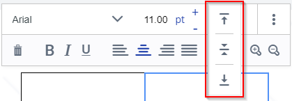
Allow vertical alignment (table)
These options allow top, middle, and bottom alignment when enabled for tables.

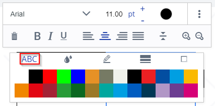
Allow font colors (table)
If enabled, the customer can change the font color for tables. Below this option, it is possible to select which colors are allowed.

Enable background colors (table)
If enabled, the customer can change the background of a cell in a table. Below this option, it is possible to select which colors are allowed.

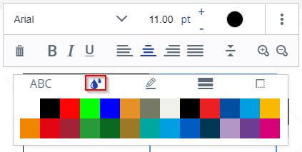
Margin (table)
If enabled, the client can change the border of the cell.

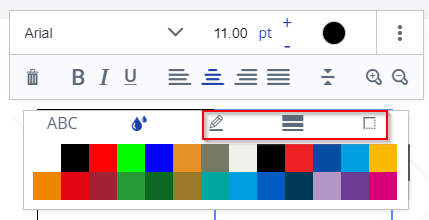
Margin width (table)
If enabled, the customer can change the border width of a cell.

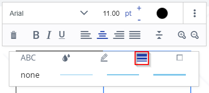
Border color (table)
If enabled, the client can change the color of the cell border. The usable colors can be selected below this option.

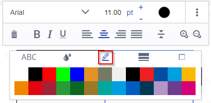
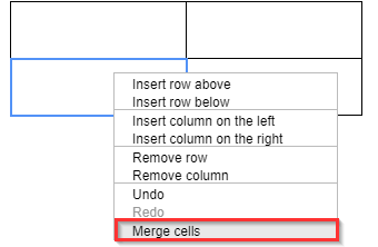
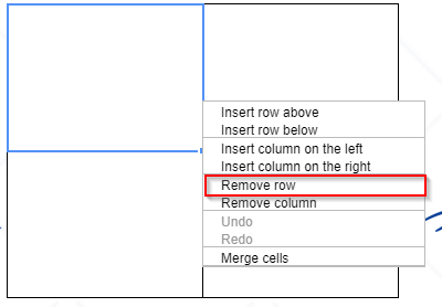
Connect cells
It allows the customer to connect his cells.
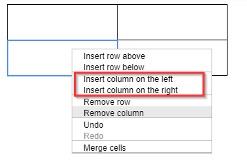
Insert columns
It allows the client to insert columns into tables.
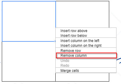
Remove column
It allows the client to remove columns.
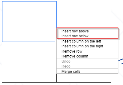
Insert rows
Allows the client to insert a row into his table.
Remove row
It allows the client to remove rows in tables.
Enable zoom function (table)
When the client clicks on a cell to insert a text, the editor zooms into the text field, making the text field larger and easier to edit.

OTHER OPTIONS
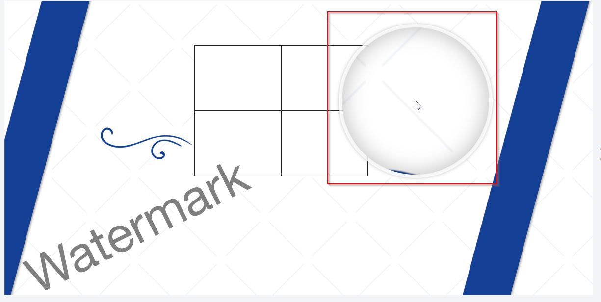
Activate magnifier in preview
This option activates a magnifier in the preview. The option below it sets the zoom value of the magnifier.
Enable Undo/Redo
This enables the Undo and Redo buttons in the editor.

Activate Helpers (OTP)
Allows the customer to activate and deactivate the helper in the frontend.

Allow duplicate block
This allows duplicating any block on the template.


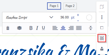
Allow opacity
This allows you to set the opacity for each block in the template.

Allow second-page numbering
Another way to display pages.
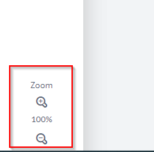
Allow editor zoom
Allows zooming in the editor.
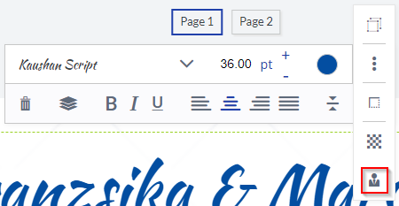
Allow layers for blocks (Designer)
Allows changing the layer of the block.

Allow mouse zoom (Designer)
Use the scroll wheel to zoom in and out of the editor.
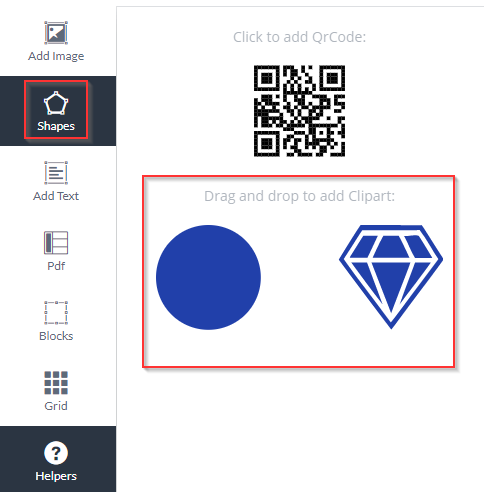
Allow shapes
Allows adding shapes to the editor. Under this option, you can select the shapes that should be selectable in the editor.
Allow Pdf vt
The customer is given the opportunity to use the functionality of the PDF VT editor.

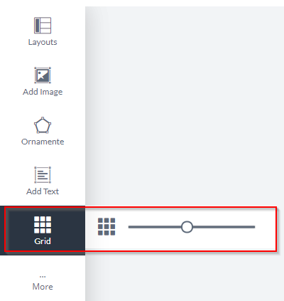
Allow grid
If enabled, the client can activate a grid in the frontend.
Allow inline color (OTP)
If enabled, the client can color characters in a text block in different colors.

Allow hyphenation
Allow hyphenation in multiline text blocks.
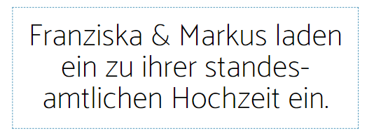
Allow text field connections (OTP)
Allows connected text fields.
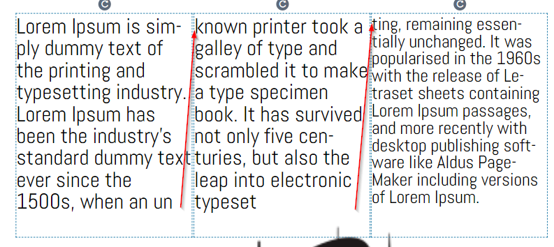
Allow backgrounds (Designer)
This option allows backgrounds on the template. The backgrounds used on the template can be selected below.
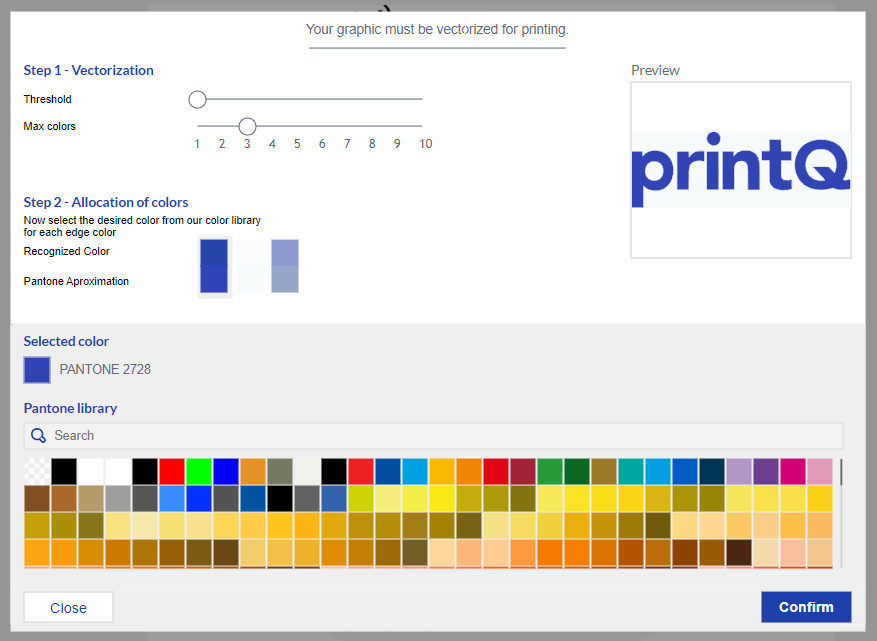
Allow image on the vector (Designer)
This setting enables our vectorization tool for the designer. Here the customer can vectorize his images. At the same time, Pantone colors can be used. For this, our toll already creates a suitable mapping with suggestions.
The vectorization can also be "forced". Just activate the setting "Direct vectorization of images and pdfs".
In addition, the use of Pantone colors can be restricted both generally and to the number of spot colors ("Allow Pantone colors in editor" and "Allow maximum number of Pantone colors").
IMPORTANT: A separate license is required for the vectorizing tool.
Allow finishes (Designer)
When this option is enabled, the customer can choose finishes for their products. The options that can be used for the product can be selected below. IMPORTANT: A separate license is required for this feature.
Allow Pdf upload
Allows customers to upload a PDF in the editor.
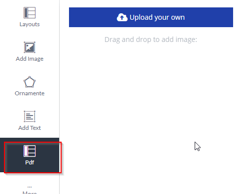
Number of elements in the sidebar
Changes the number of displayed elements (e.g. text block, images, PDF, etc.) in the sidebar in the editor.

Zoom im Bearbeitungsmodus zulassen
Erlaubt das Zoomen im Bearbeitungsmodus.

Allow API images (this applies to API products only) (Designer).
Allow API images in the editor. This works only if the API gallery is enabled.
Allow logo block (this is only relevant for API products) (Designer).
This is only relevant for API templates.
Here you have a logo block that can be used when this option is enabled.
Ignore background image and color in 3D preview (Designer)
When the 3D preview is enabled, the color and background are ignored.
Allow submodels (Designer)
When enabled, allows the customer to see their product on a sub-model or a variety of sub-models that can be selected below. Only works in conjunction with the "3D Preview" setting. If this is not selected in the Setup tab, you will not see your submodels.
Allow shape colors
If enabled, the customer can change the color of the shape. The colors can be selected below this option.

Allow login/registration (Designer)
Allows customers to log in to your account or create an account through the editor.
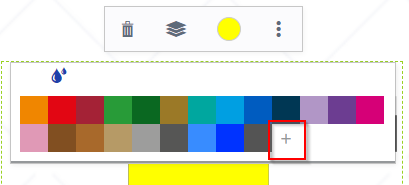
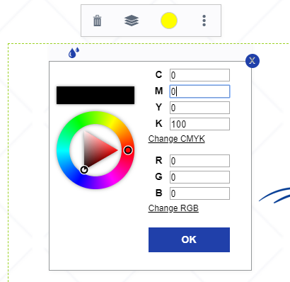
Allow color picker (OTP)
If enabled, the customer can use the color picker.

Show the die-cutting contour in the foreground in the preview and ruck pdf (Packaging products)
Decide whether the preview and print PDF should contain the die-cutting contours.
Change the 3D image quality
Change the quality of the 3D model within the preview.
Allow rotation in angles
Here you can set whether blocks can be rotated freely or only at certain angles.
Enable Overlapping Zones
Allow overlapping zones to be used for packaging. However, this requires configuring the zones within the packaging itself. You can read more about this in the “Packaging Editor” section.
Allow updating of overlapping zones
Enables a Refresh button at the top of the editor to update the overlapping zones.
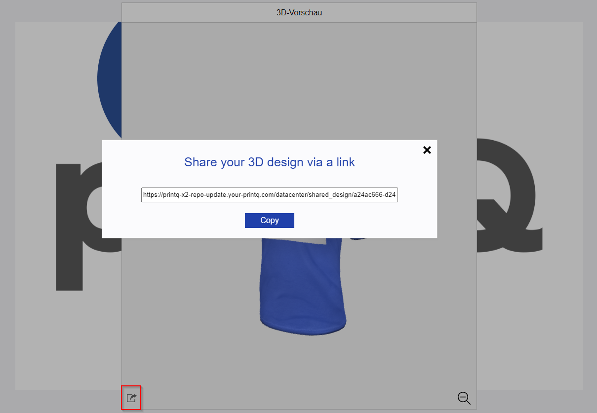
Share 3D Design
Allows you to create a link for the generated 3D preview including your own design. This link can be shared so that other people can watch the preview and design without having the possibility to make changes.
